David Byrne
March 7th, 2005 At least 300 people showed up tonight to see David Byrne give a Powerpoint presentation about Powerpoint. [Free video of the talk may be available soon.]
What luck it was to happen upon one of the best seats in the front row. As Byrne was introduced he sat on the stage, about 5 feet away. The only camera I had was the crappy one on my mobile phone but I couldn’t resist a few shots.
Along with David Bowie and a few others, Byrne got me through my childhood during the 1980s. As a kid I loved his otherworldly tunes and that deeper, darker, subtler vibe that set him apart from the shrill, candy-colored MTV culture that overtook pop music in those days.
I can’t agree with all his Powerpoint points, but it’s fascinating to consider how he views this tool. The user interface geek in me is dying to watch him work with it firsthand in his natural habitat.
I wanted to step up and hug him when he said that a Powerpoint presentation is just part of a larger “performance” which includes not just the person speaking but the audience, the room, the surroundings. Software designers, even self-professed user interface and needs analysis experts, can learn a lot from Byrne. The point seems like an obvious one, but we’re still stuck in “user-centered” tunnel vision: we design for a prototypical single person staring at a single computer, as if that person and computer operate in a vacuum. This approach can be worse than meaningless if you ignore the surrounding context. This tunnel vision can be downright dangerous as we design software that moves beyond the desktop and into public spaces.
Byrne presented another intriguing argument: that Powerpoint’s constraints, particularly its “low resolution,” can be a benefit. (He meant “resolution” in the way the Powerpoint-loathing Edward Tufte uses the word: in terms of graphics quality but also in more general terms of how much information standard Powerpoint templates allow you to convey to an audience at a time). Simpler, lower-resolution images force the audience to become involved more in the presentation because they have to actively connect the dots.
This brought to mind a couple of analogies. Think of how books and radio can seem richer than television — the lack of visuals forces the audience to actively imagine the action, to envision many details that aren’t explicitly described.
Scott McCloud pointed out in his book Understanding Comics that many protagonists in popular comics are drawn in a simpler, less detailed style than other characters and their surroundings. Think of Tintin or Orphan Annie. McCloud theorizes that readers can more easily sympathize with minimally-drawn heroes because they can more easily project themselves into those characters. The more details you give a character, the less that character shares in common with a given reader. On the other hand, the story can be more compelling if faraway lands that the character visits, and other characters that the character encounters, especially bad guys, are drawn in a detailed manner — because intricate detail in itself can make those thing seem more foreign, interesting or even frightening.
Does this apply to Powerpoint? I don’t think so… I still hate Powerpoint and the agonizingly dull, ubiquitously unimaginative corporate communication style that its use has embodied and encouraged since Microsoft purchased the software and took over its development and marketing. The world needs more elegant and customizable presentation tools, which can be made just as easy to use for non-techies as Powerpoint. Constraints can be a blessing, but the wrong sorts of constraints can be a curse.
Anyway, it’s fun to watch Byrne turn the Powerpoint tradition on its head.


 But Davis points out in his paper that some written human languages don’t use words at all but instead directly represent meaning visually. The image to the right is a message written in such a language, by a member of the Yukaghir tribe in Siberia. (See Davis’
  This week’s O’Reilly
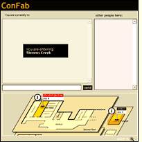
  Many of them are engaged in online chat rooms.
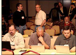
  People collaborate to take notes on the presentations and discussions using


 “We are increasingly entrusting to software the various gathering, sorting and linking operations that we used to perform for ourselves and that were part of the process of thinking about a subject… The shift from book to screen may in its eventual impact on what knowlege is be as transformative as the shift from Newtonian to Einsteinian physics.”